Fillable Website Design Questionnaire [PDF / Doc Template]
Don't know what to ask customers when starting a website design project? Use this questionnaire template, available in PDF and Doc formats (100% free).



Working on a website design project?
Here's the perfect questionnaire template for you.
A good website design questionnaire should have no more than 12 - 15 questions before the sale and 6-9 questions after the sale.
The goal is to gather the data you need to do a good job and nothing more.
On the other hand, a bad website design questionnaire:
Since "good" design can be subjective, you want to gather as much information about the customer's point of view rather than pointing questions around what you—the designer—would like to do. Start with their requirements.
Then provide your professional opinion.
If you've downloaded the template, you'll notice 3 distinct sections:
You want to cover all 3 areas to write a good website design questionnaire.
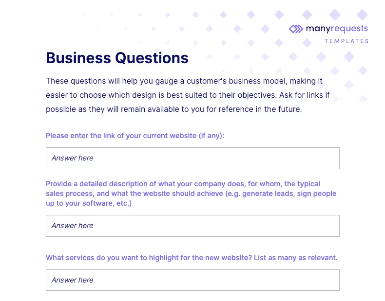
Before you even ask for what the website should look like, you want to know who you're creating it for, but especially who they want to publish it for.
(i.e. who their customers are—the end users).
You want to do this first because, with the context of your prospect's industry and products, you'll have a better understanding of both the website's design and technical requirements.
For example, you wouldn't want to use flashy colors for a company selling devices for people with special needs, and you'd need to pay immense attention to accessibility features for the website. Some of the questions to ask here are:
It's best to start open-ended here and close things down as you move through the form. That allows your prospect to get as much information down early in the process and then check a few boxes as they go.
You want to gather as many live URLs as possible.
Those will stay with you as references for a long time.
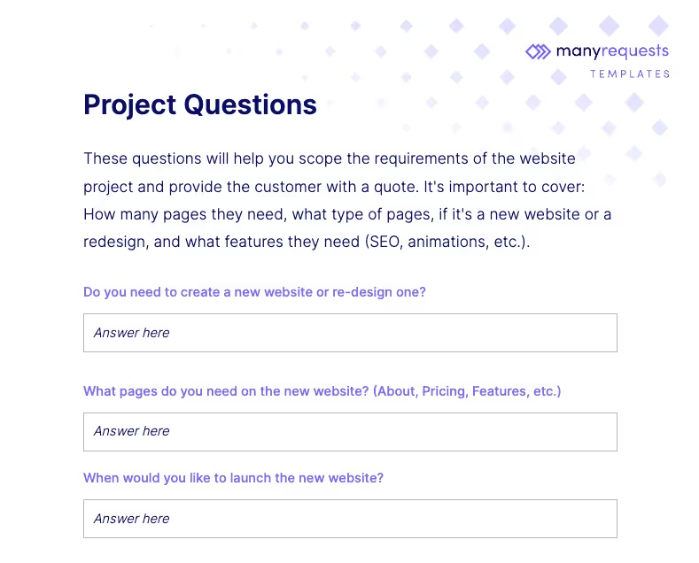
The technical / creative part of website design is where most will start with their questionnaire. This is perfectly fine if you already know who your customer is selling to and why (the business objective).
Just don't jump straight into it without any business information to back it up.
You'll struggle later on with endless revision requests.
Some of the questions to ask here:
Depending on the business model and industry of your prospect, you might want to customize some of these questions to reflect the type of website they need: e-commerce, B2B, events, etc.
The goal here is to get a tangible sense of how much time the project will take to complete, the complexity of the functionality required, which roles and technologies will be involved, and so on.
Once this information is provided, you are ready to send out a quote!
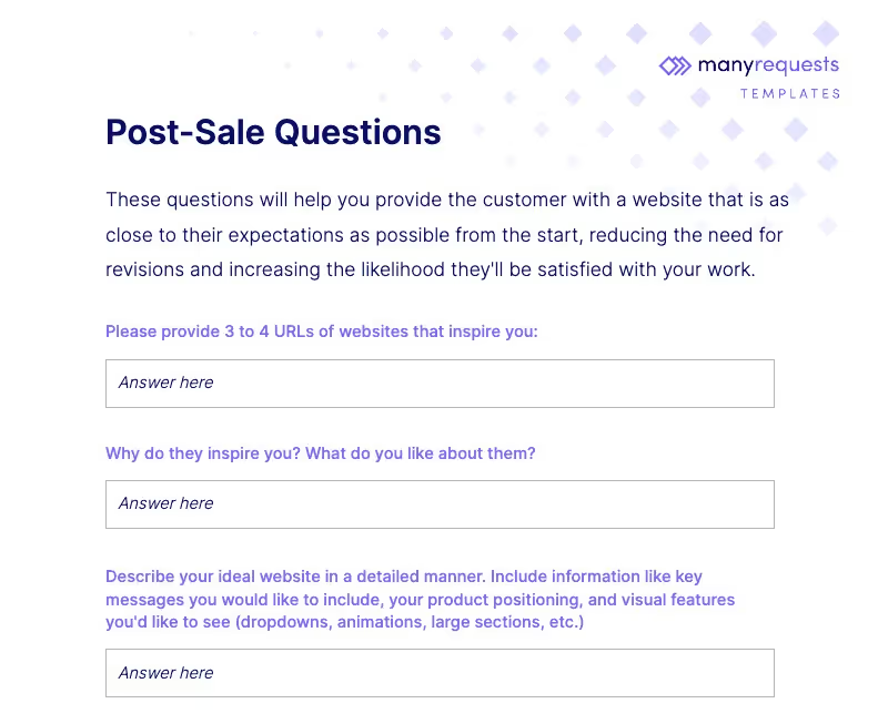
It might sound counterintuitive to ask questions after the sale, but it's a smart tactic as customers are usually most engaged with your brand pre- and post-purchase.
Especially for productized service agencies, asking additional stylistic questions after the purchase ensures the customers provide you with the most accurate information.
10 - 15 minutes of their time becomes trivial after spending 1000s of $ on a website.
Here are some questions to ask post-sale:
Here, you want to ask for reference information like a "URL that inspires you" because that's how most prospects will reason about their new website.
"I like the way this site looks—I want something similar."
You'll get that all the time.
Then, once you have a good frame of reference, you can ask for a more open-ended description, followed by materials such as source content, images, text, and brand guidelines. This is the time to have them spill all the beans!
The questionnaire presented above uses a set of sample questions that apply to most website design projects, but you can customize the doc with any question.
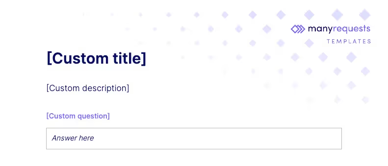
A few things to note before you do so:
The more you can craft questionnaires that target the type of websites your clients are most likely to request (e.g. e-commerce, b2b saas, etc.), the easier it'll be for them to fill them out.
Now, here's a Goliath vs. David question.
Should you use trusted (but old) PDFs, or should you invest in a more sophisticated live form solution? As most business matters go, the answer is—it depends.
I'm starting with live forms because of an important distinction:
» In 90%+ of cases, live forms are always better than PDFs.
There are multiple reasons for this, but the main one is—they're more reliable.
Imagine sending out a form, asking the customer to fill it out as a requirement, and they don't. Or they do, but they don't send it back.
Or they only fill it in partially, leaving important information out.
These are all things that will happen with PDFs.
With live web forms, you can enforce data submission.
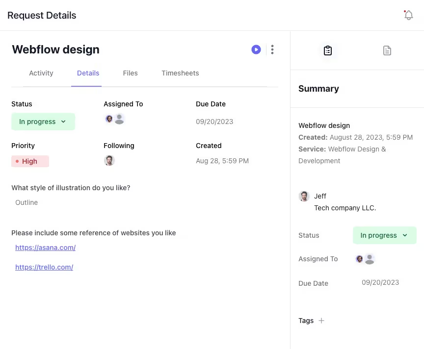
So you always get the most up to date information delivered to your doorstep without worrying about a customer's forgetfulness or delayed response via email even if they completed the form days ago.
That's major reason #1.
Major reason #2 is that they are more efficient.
You don't have to personalize each form to each individual customer manually, the live form solution will take care of that for you.
All you have to do is select the right questionnaire and click send.
This is a huge time saver as your freelance business or agency grows.
Other minor reasons are:
Really, if you can go for live web forms, there's no reason not to.
Fillable PDFs and Word docs are great for either:
Basically, if you're running a solo effort and have the time to personalize forms for each customer, then it's a viable option. Same if you absolutely need to impress a high-ticket prospect with a proposal that includes a fully-custom questionnaire specific to their needs. You can't standardize that.
But apart from these 2 scenarios, there are a lot of drawbacks to using PDFs:
Some of these drawbacks, like that of open-ended questions, are solved with Word files. But static files just fundamentally cannot solve the data consistency and efficiency issues. That's why web forms are the way to go in most cases.
PDF and Word docs are great.
They've been a staple of business for decades.
But they're a very stiff way to gather design requirements: find the template, customize it to the client, re-download PDF, send via email with a long explanation, wait until you get an answer… It's an effective but inefficient process.

ManyRequests offers you that same effectiveness, but:
It's the natural evolution of and offline, tiresome PDF workload.
Try it free for 14 days, you'll see the benefit within a few days, especially if you're already in talks with a prospective customer.
1. See how ManyRequests works in real life. Start a free trial and experience how productized agencies centralize requests, reduce chaos, and streamline delivery, without changing their entire workflow.
2. Read our Implementation Guide to launch smoothly with your team and clients.
3. Follow us on LinkedIn and YouTube for practical agency growth strategies
4. Check out The Productize Blueprint to learn how to turn your services into a scalable, productized offer.
